Was that blog title long enough? ![]() So, some of you know that I make my own covers. I even shoot some of the YA one’s myself. Anyway, I posted the info below for people who ask what were some of the major factors in my recent accomplishments, which include 6 New York Times bestsellers since January, TWO #1 Amazon bestsellers, and over 1.5 million books sold.
So, some of you know that I make my own covers. I even shoot some of the YA one’s myself. Anyway, I posted the info below for people who ask what were some of the major factors in my recent accomplishments, which include 6 New York Times bestsellers since January, TWO #1 Amazon bestsellers, and over 1.5 million books sold.
I’m 100% Indie and never went the traditional publication route (my control freak article in FORBES sheds a little light on why I self-published), and the stuff below played a huge factor in my success.
Thought I’d share for all my author friends out there.
***
Okay, my all time fav covers are YA PNR. Angel wings, demon eyes, and fluffy skirts on kick ass young women. *swoon* So, when I go to make an NA cover, my brain is like, “But it needs a dragon…” Technically, dragons make it fantasy, but dude – dragons are awesome! What romance cover wouldn’t look awesome with a dragon in the background with its wings sprawled?
So as you can see, my creative self is conflicted when I make new covers. I’ve posted some of these before, but I wanted to do it again, and include a final cover that had a branding issue. This kind of stuff is visual and I don’t know about you guys, but it helps me to actually see the difference, which usually results in a face palm.
SECRETS was the second book I wrote in the romance genre.
ORIGINAL COVER:

NEW COVER:

This one was the biggest oops: I wanted the cover to reflect the artistic stuff in the book. Problem: No one could identify the genre of this book based on the original cover art. Someone mentioned they thought it was going to be a thriller when it first came out. I was like, you’re cray cray, dude. And I was totally wrong.
What I learned: COVERS ARE STOP SIGNS. They should quickly reveal as much info about your book to the reader as possible and this did not. As soon as I changed the covers to the current version, sales shot up. By Christmas 2012 (book 1 in this series appeared last summer) the series was selling better than I’d ever hoped.
You’ll also notice that I had a pen name, which I stopped using late last year. Even though the pen name wasn’t a secret, people didn’t buy the books. It could have been the covers, or it could have been a lack of fans for Ella. By last summer, I had a small, loyal fan base for HM Ward. Ella had around 5. I could have branded both names, but time is an issue so I didn’t go that route. I used the name that already had the following – mine. ![]()
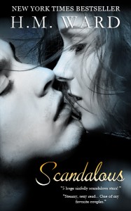
Here’s another example of stupid cover mistakes–SCANDALOUS. This book was my debut romance novel, and it was a sleeper. It did nothing for 9 months and then shot up and landed on the NYT bestseller list. In Jan of this year, I changed the cover and pulled it back under my name just before running an ad. People saw it, could tell what it was, and tried it. Plus, the ppl who read it when it first came out really liked it, so they pimped me out – all 5 of them! Seriously, those people are awesome and I can’t thank them enough. Don’t be stupid like I was. I had a serious cover crush on the old version and did NOT want to change it. The painting on the cover is IN the book. Short version: I was really stupid. Don’t wait 9 months to change covers or descriptions on books that aren’t preforming.
OLD COVER:

NEW COVER:
Okay, and here’s the last cover screw up I’ll show you for today–STRIPPED. ![]() This is my next novel (no dragons
This is my next novel (no dragons ![]() ) and it needed to be tied to the DAMAGED series. I did something stupid, in terms of branding. I have a series within a series. People weren’t getting it, so I’m trying to go back and brand the covers better.
) and it needed to be tied to the DAMAGED series. I did something stupid, in terms of branding. I have a series within a series. People weren’t getting it, so I’m trying to go back and brand the covers better.
This book was giving me all sorts of grief. The tone was a little off and the type-font was bugging me. Yes, I made it, but sometime I don’t see the issues until later. I think the mismatched branding was bugging me. I changed the cover last night and by this morning, the preorder ranking shot up quite a bit.
OLD COVER:

NEW COVER:

The new cover has that somber thing that DAMAGED has, plus matching fonts which should help connect the series. Now, instead, of comments like ‘LOOK! ITS SUPERMAN!’ the fans are saying ‘Awh, what’s the matter with Peter’s brother?’ which is way closer to the reaction I want.
Making my name legible was also a face palm. Ah dher.
And then when this book was on preorder, everyone and their dog started using the cover image. So I had to change it again. This is the current cover:

Anyway, I have more examples of me being stupid, but the point of this post is to actually see the issues and not be afraid to change them and try something new. If you have a solid story and it isn’t selling, go back to the trifecta of awesomeness: COVER, TITLE, BLURB. Those things combined make a little stool, and all three legs need to be functioning to get ppl to look at your sample. If one is off, it knocks over your whole thingamadobie. Mine have been off and that’s okay. We’re not locked into keeping a crappy cover (meaning it doesn’t sell) b/c we’re indie. Change it as many times as it takes.
Examine what works and what doesn’t. Change things one at a time to see what the issue is. I totally thought it was my books last year. I was slamming my head into the wall b/c I wrote SEVEN new romance titles, all of which were sucking up the charts and doing nothing. It’s amazing how tweaking a few things can change EVERYTHING. Since Jan of this year, I’ve had 6 titles on the New York Times bestseller list. It’s like, SHUT UP! I know! And if I kept my artsy covers it would have never happened.
I’m supposed to be in the writing cave… gots to go. Hope this helps someone see the things that took me nearly a year to figure out. ![]()
*Update: My numbers jumped from 1.3 million to 1.5 million. Forgot to add this months sales. ![]() Told you that I’m a dork.
Told you that I’m a dork.